TL;DR

Collaborated with the founder to evolve their voice-first dating app—clarifying product vision, refining user flows, and creating a more intuitive, emotionally resonant experience that prioritizes authenticity over appearance.

Background

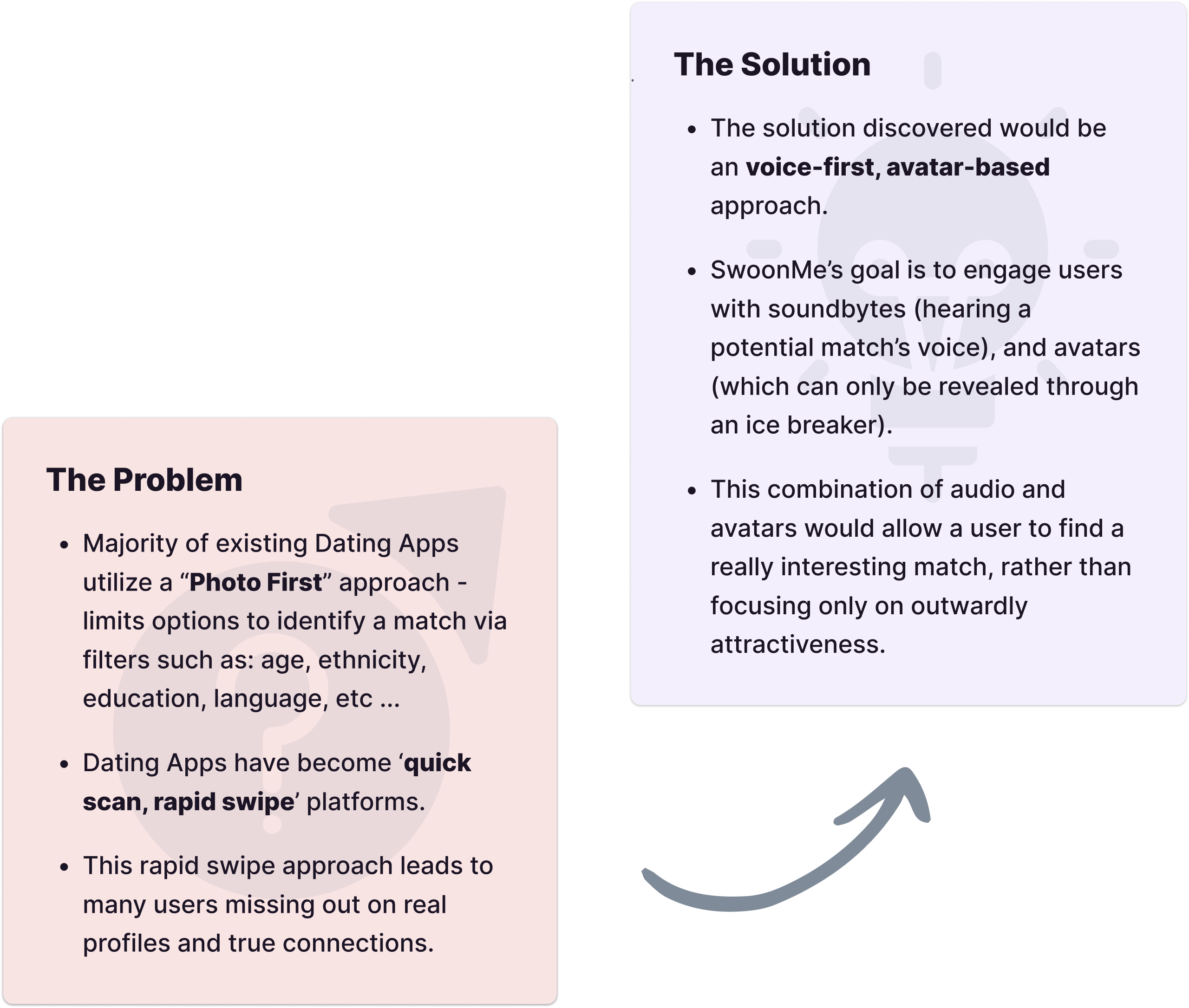
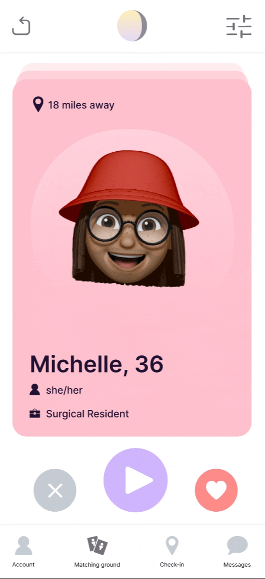
SwoonMe is a voice-first, avatar-based dating app created to counteract the superficiality of photo-driven platforms. Rather than relying on appearance alone, SwoonMe allows users to form connections through voice interactions and meaningful icebreakers, revealing a potential match's avatar only after initial engagement.


Designed for singles looking for long-term relationships, SwoonMe aims to replace "doom-swiping" (mindlessly swiping with little intention to connect) with deeper, more human interactions.

Team & role

Role

Lead Product Designer

Team

Tanvi (Founder/PM), Bryce (Engineer), Allie (Marketing) & Myself (Design)

Tools & Methods

Figma, Asana, Research, Wireframing, Wireflows, Prototyping, Usability testing, User interviews, QA testing

Duration

6 mo.

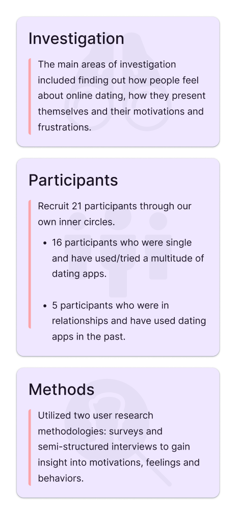
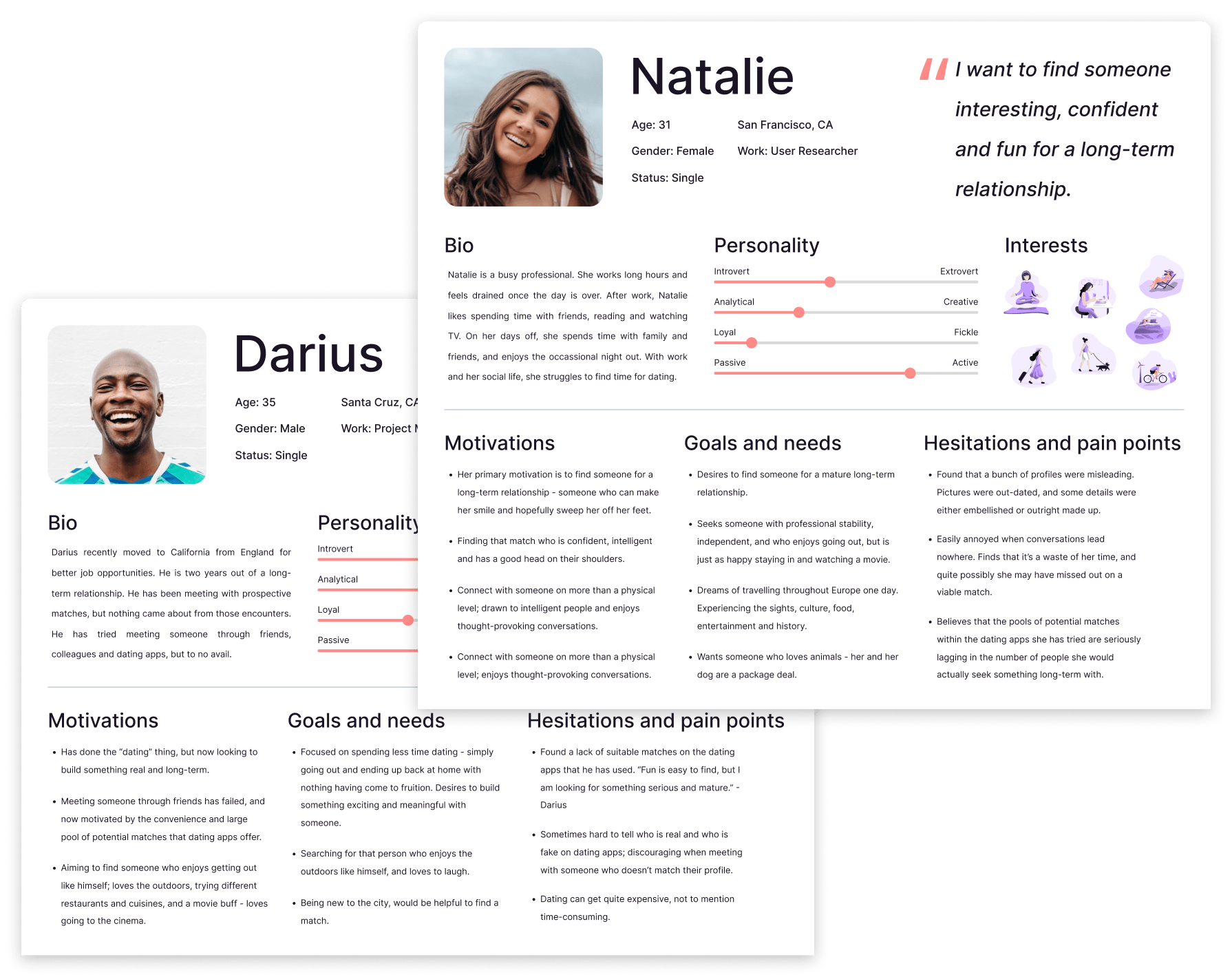
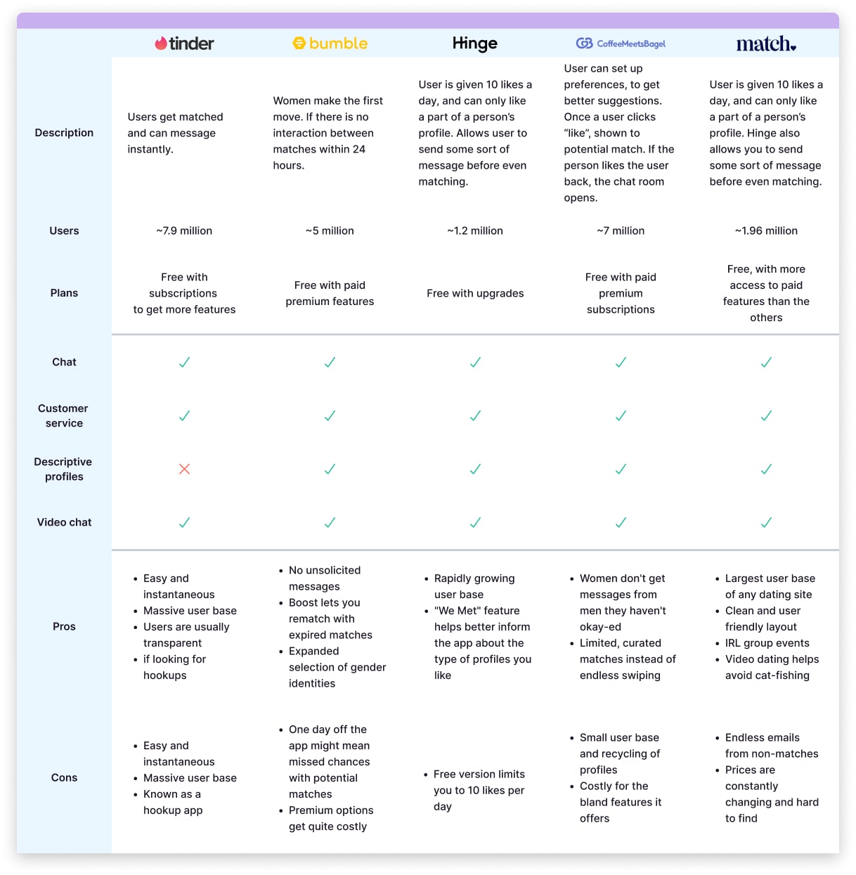
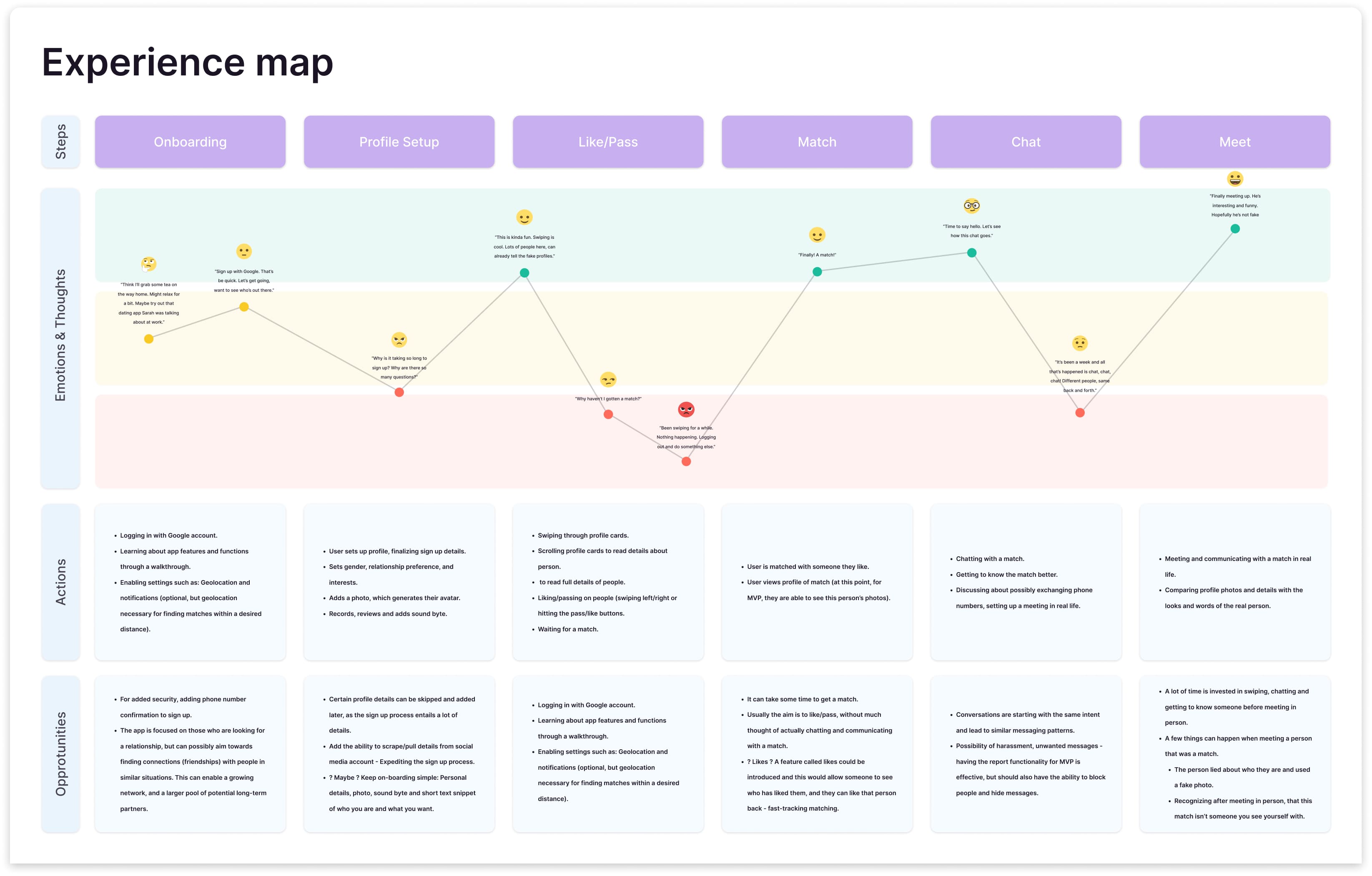
Recognizing the problem

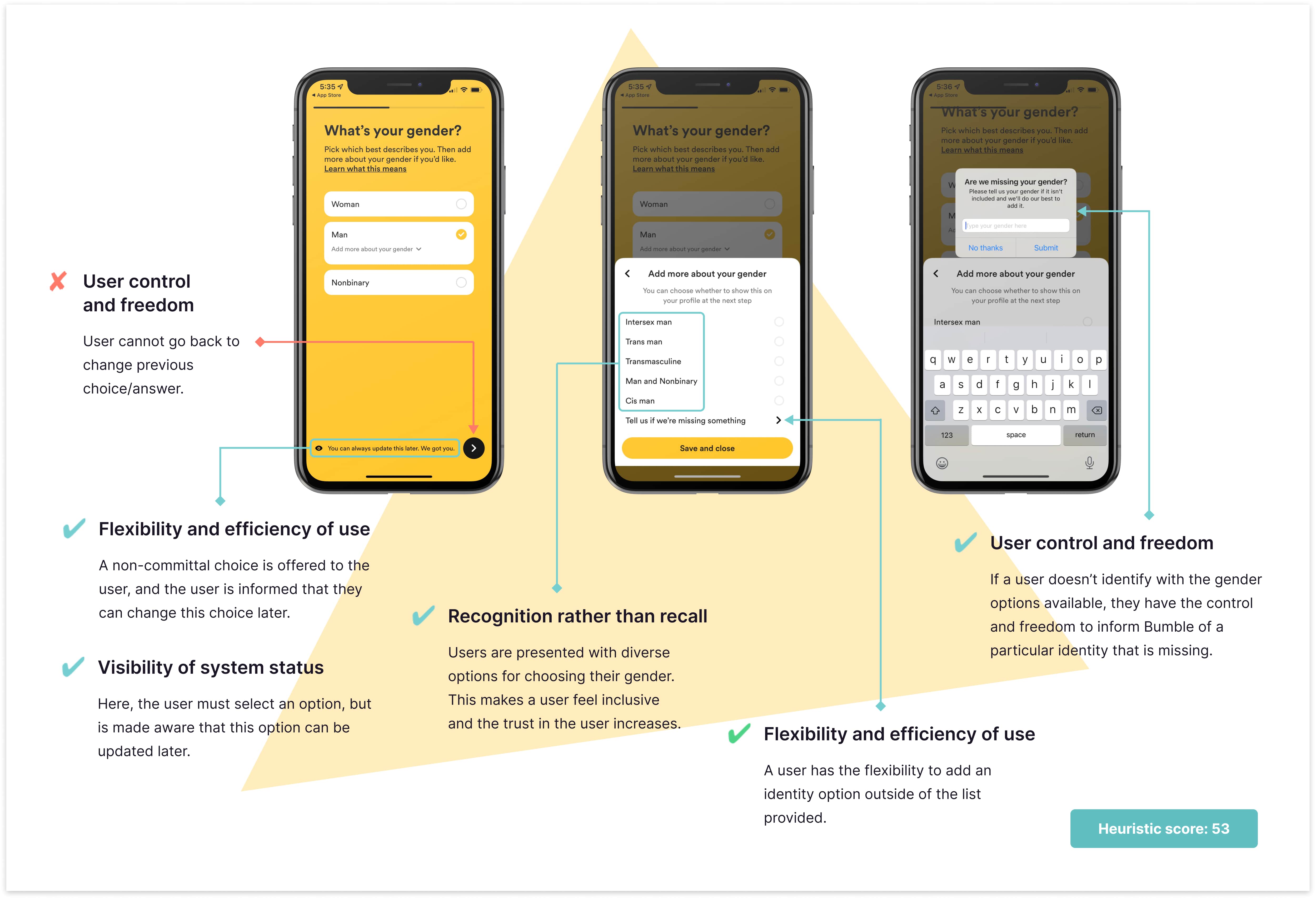
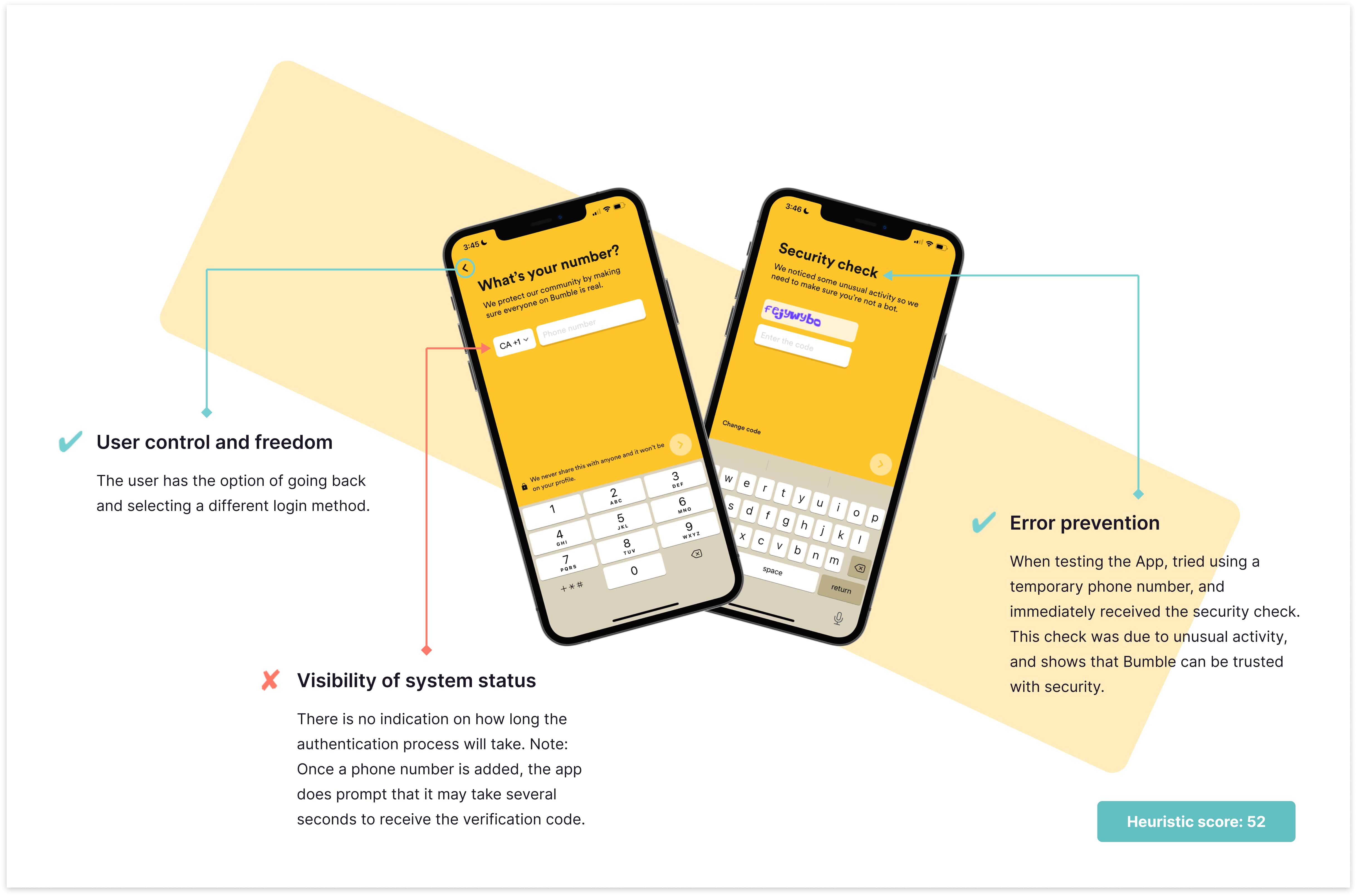
Most mainstream dating apps adopt a “photo-first” approach, where users make decisions based largely on physical appearance. This behavior leads to shallow engagement, ghosting, and a lack of meaningful connections..

We articulated the problem as: "How can a mobile dating app be improved to increase the number of real connections that lead to long-term relationships?"

Discovering a solution

Our hypothesis: by leveraging audio (sound bytes) and avatars, we could encourage users to connect based on personality and voice first, rather than appearance.

Additionally, we introduced an icebreaker feature: a curated set of questions tailored to each match, designed to initiate more meaningful conversations and reduce awkwardness.

Conducting user research

We recruited participants through social media and personal networks.

16 single participants currently using dating apps..

5 participants in relationships who previously used dating apps.

Key Insights:
  • Low Match Rates: Many men reported rarely getting matches.
  • Lack of Reciprocity: Female users often did not respond to initial messages.
  • Slow Momentum: Even after matching, it could take a long time to progress to a real-life date.

Creating user personas

From our research, two key user personas emerged:

Natalie: Seeks quality over quantity. Wants authenticity and someone who can initiate real-world plans, not just endless chat.

Darius: Previously casually dating, now ready for something serious. Prioritizes efficiency and deeper engagement in the dating process.

Evaluating domain research

We conducted domain research on existing apps—particularly Bumble—to identify common usability issues and feature gaps.

Evaluating domain research

We conducted domain research on existing apps—particularly Bumble—to identify common usability issues and feature gaps.

Performing a heuristic evaluation

A heuristic evaluation was conducted on Bumble to understand usability and spot design deficiencies.

The rules

Before the evaluation, a marking scheme was defined.

Marking scheme:

  • +1 (heuristic score plus one) Obeys Jakob’s usability heuristic.
  • -1 (heuristic score minus one) Disobeys Jakob’s usability heuristic.

Scoring:

  • The initial score was set at 51 (on a scale of 1-100). * The heuristic score fluctuates according to marks rewarded.

Performing a heuristic evaluation

The process

The heuristic evaluation was divided into three phases, each targeting the most commonly used features to uncover usability issues where they mattered most.

Phase I focused on onboarding and the core matching experience. Phase II examined post-match interactions, including messaging and chat functionality. Phase III evaluated account-related features such as profile management and user preferences.

A cumulative usability score was calculated at the end of all three phases to assess overall app quality and identify improvement areas.

Performing a heuristic evaluation

The results

The initial evaluation began with a score of 51%. After completing all three phases, the cumulative score rose to 61%, indicating that Bumble is generally well-designed from a heuristic standpoint.

The evaluation helped identify usability gaps and design shortcomings, providing actionable insights to inform and guide future design decisions.

Defining the MVP

At this stage, research had provided a lot of valuable insights and we shifted our focus to defining our MVP.

We decided on the features we believed would be valuable to users and remained steadfast on our vision of a voice-first, avatar-based dating app solution.

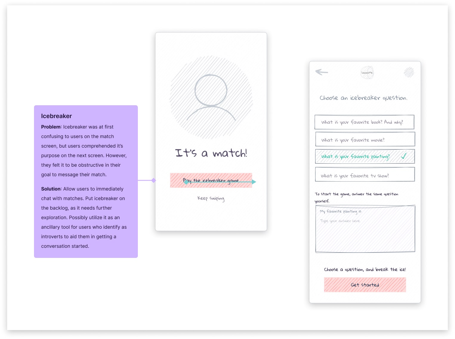
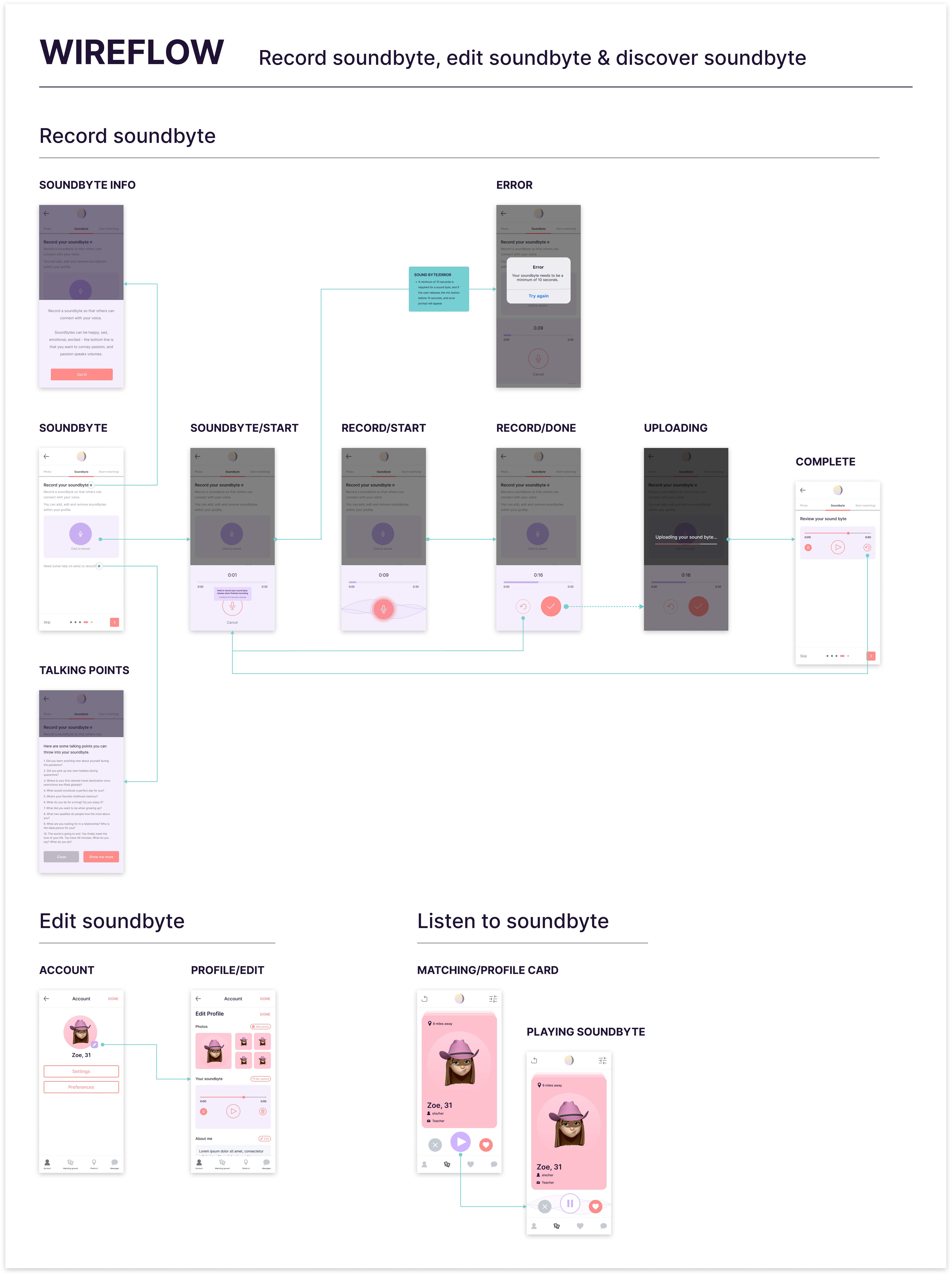
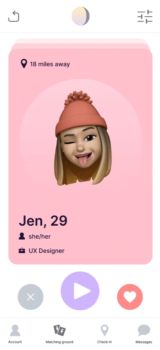
Through audio snippets (which we dubbed "sound bytes"), the voice of a potential match could be heard and allow for a more meaningful connection rather than simply basing decisions on photos. Utilizing avatars - before revealing real photos - was a strategy to ensure people did not get stuck on physical attributes. Finally, icebreakers would ensure a conversation is actually started.

  • Must-Have Features: Onboarding, Voice "sound bytes", Profile creation & preferences, Matching interface & profile cards, Match list and messaging.
  • Nice-to-Have Features (revisited post-MVP): Icebreakers, Check-in (location-based feature). *Both features were initially scoped for MVP but were postponed after testing revealed complexity in implementation and user understanding.

Mapping the experience

I built an experience map to visualize the user's journey from onboarding to matching and chatting. This helped us identify pain points, highlight opportunities, and improve the flow before moving to wireframes.

Mapping the experience

I built an experience map to visualize the user's journey from onboarding to matching and chatting. This helped us identify pain points, highlight opportunities, and improve the flow before moving to wireframes.

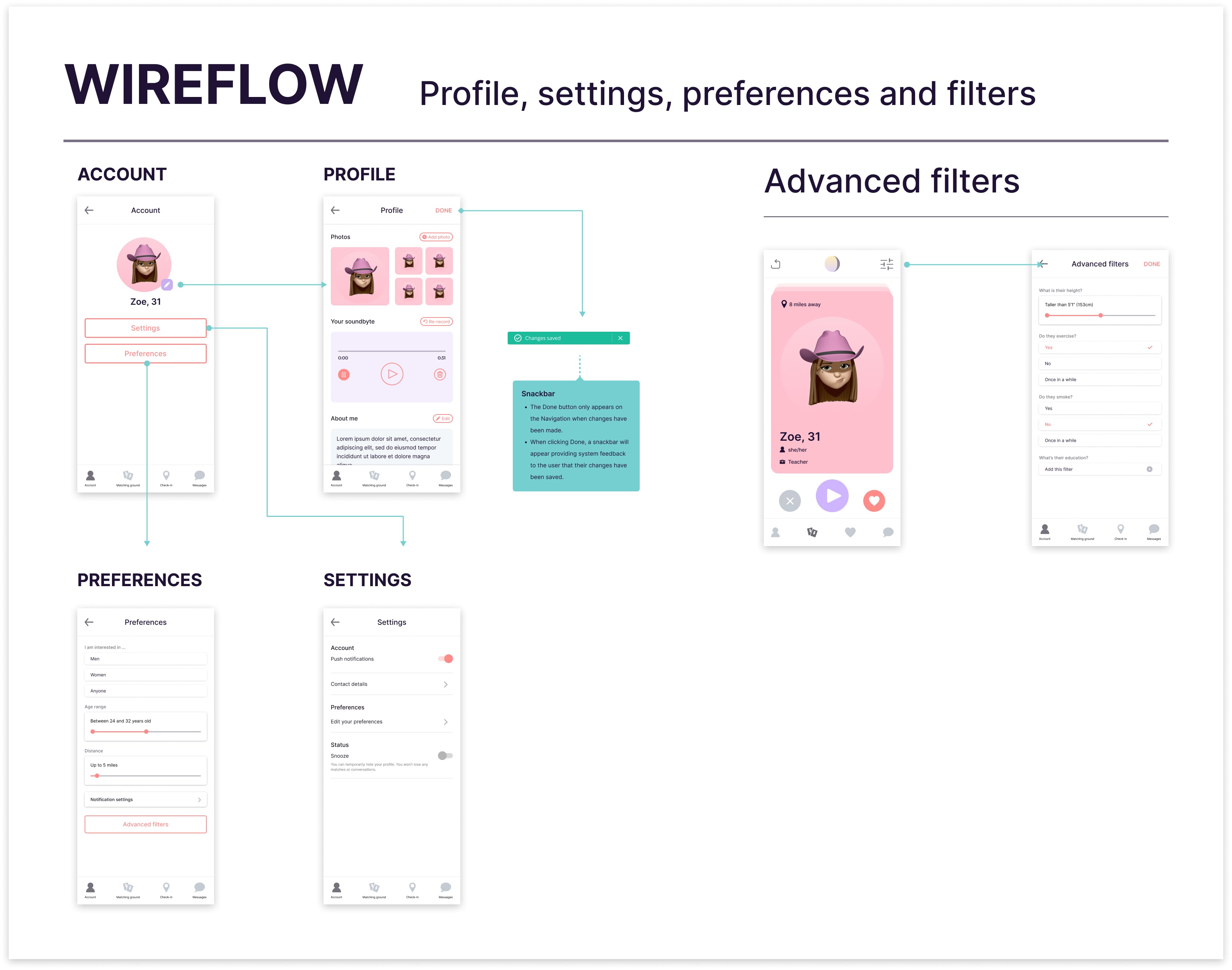
Prototyping & testing
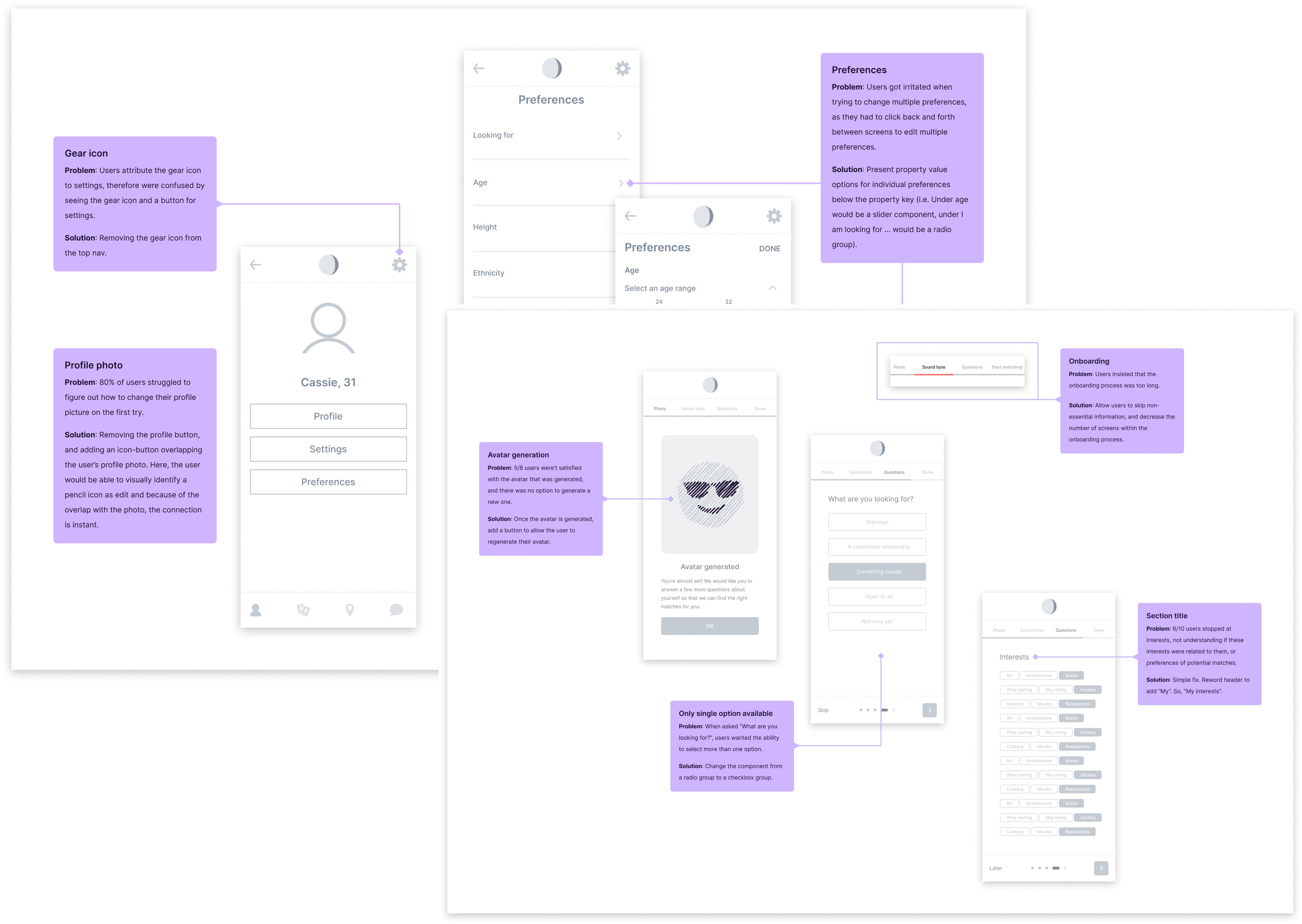
Lo-fi testing

We tested early wireframes assuming users had already completed onboarding.

Findings: There was confusion about the Icebreaker feature. Users expected to jump straight into chat after matching. The icebreaker was perceived as an unnecessary step.

Response: Icebreakers were postponed for redesign and testing in a future release.

Mid-fi testing

We conducted contextual inquiries using semi-structured interviews with 8 participants, testing key tasks.

    • Browsing and messaging a match
    • Adjusting matching preferences
    • Applying filters and updating profile
    • Revealing photos and re-recording voice clips

Mid-fi testing

We conducted contextual inquiries using semi-structured interviews with 8 participants, testing key tasks.

  • Browsing and messaging a match
  • Adjusting matching preferences
  • Applying filters and updating profile
  • Revealing photos and re-recording voice clips

Wireflows

We created wireflows—a hybrid artifact combining wireframes, user flows, and annotations—to clearly visualize interactions and screen transitions. This format streamlined internal reviews, improved collaboration, and helped us quickly spot gaps in the user journey.

Hi-fi prototype

A high-fidelity prototype was designed for further testing. The prototype combined visual design and interactivity that allowed us to test work flows and task success rates.

Hi-fi prototype

A high-fidelity prototype was designed for further testing. The prototype combined visual design and interactivity that allowed us to test work flows and task success rates.

Hi-fi testing

The high-fidelity prototype yielded significantly more meaningful and actionable feedback compared to the low- and mid-fidelity versions. Because it closely resembled a real app—with polished visuals, realistic interactions, and smooth transitions—users were more immersed in the experience. This level of fidelity helped surface nuanced usability issues, better simulate real-world usage, and ultimately provided clearer insights into how users would engage with the final product.

Looking back & the future

  • A New Domain. Transitioning from healthcare and network technology to online dating was a unique challenge, but one that allowed me to grow quickly by diving deep into a new user base and behavioral patterns.
  • Personal Growth. I had full autonomy in concepting and designing dynamic, user-centered solutions. Close collaboration with cross-functional teams was essential, and through strong communication and healthy tension, we translated an idea into a testable product.
  • Next Steps. Although I departed before launch, I completed designs for a gamified icebreaker feature, adding an element of fun and increasing engagement. Future plans included testing and refining this feature and expanding the telepresence experience through avatar enhancements and in-app voice interactions.