Designed and launched Crossover Health’s self-scheduling feature, leading research, ideation, and prototyping through a human-centered design process—resulting in a 72% adoption rate and a significant reduction in clinic call volume.
TL;DR
Background
Crossover Health's mission is to introduce a transformative care delivery model for health-activist employers. I was brought on as a Senior Product Designer to lead the research, design, and prototyping of the MVP for the company’s digital health care platform.
Project context
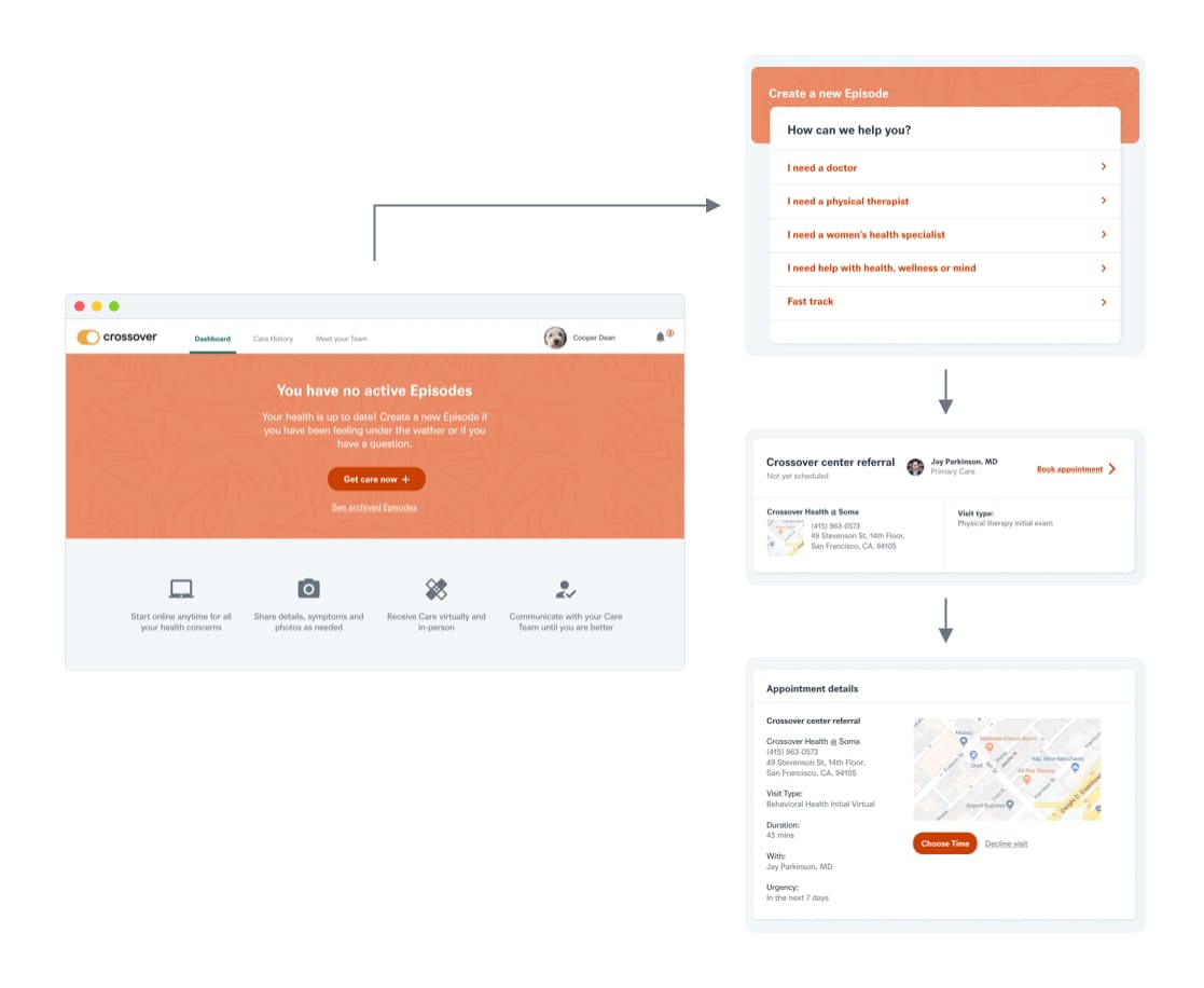
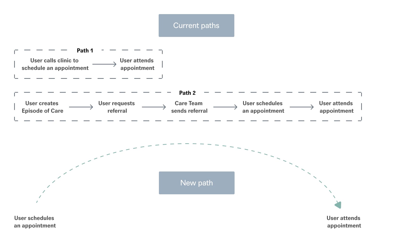
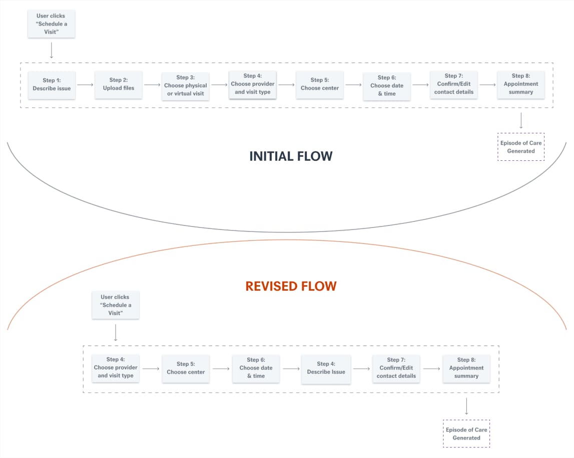
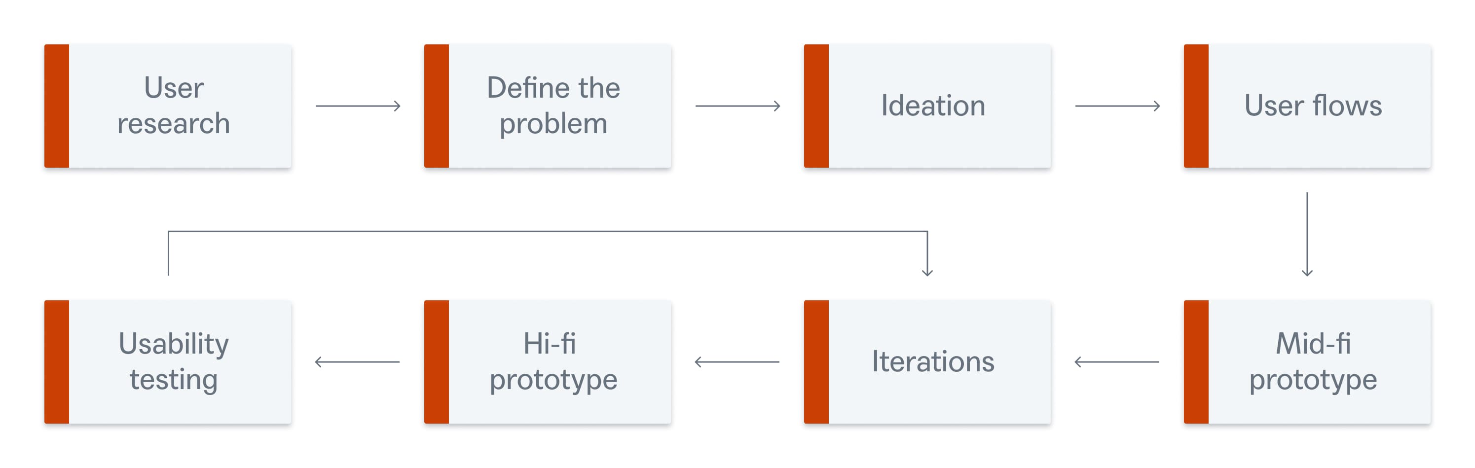
I collaborated with the team during the discovery phase for a self-scheduling feature. Our objective was to define key goals and constraints while researching how self-scheduling works on other platforms. By analyzing these platforms, we aimed to identify what features were effective and what could be improved. This research informed multiple design explorations, which were reviewed in design sessions to settle on the final solution.
Team & role
Role
Product Designer
Team
Jay (Lead), Cata and Myself (Design), Nicole & Julie (PMs)
Tools & Methods
Figma, Asana, Jira, Bugherd, Productboard, Ideation, Research, Wireframing, UI mockups, Interactive prototyping, Usability testing, QA testing
Duration
2.5 yrs
Ideation
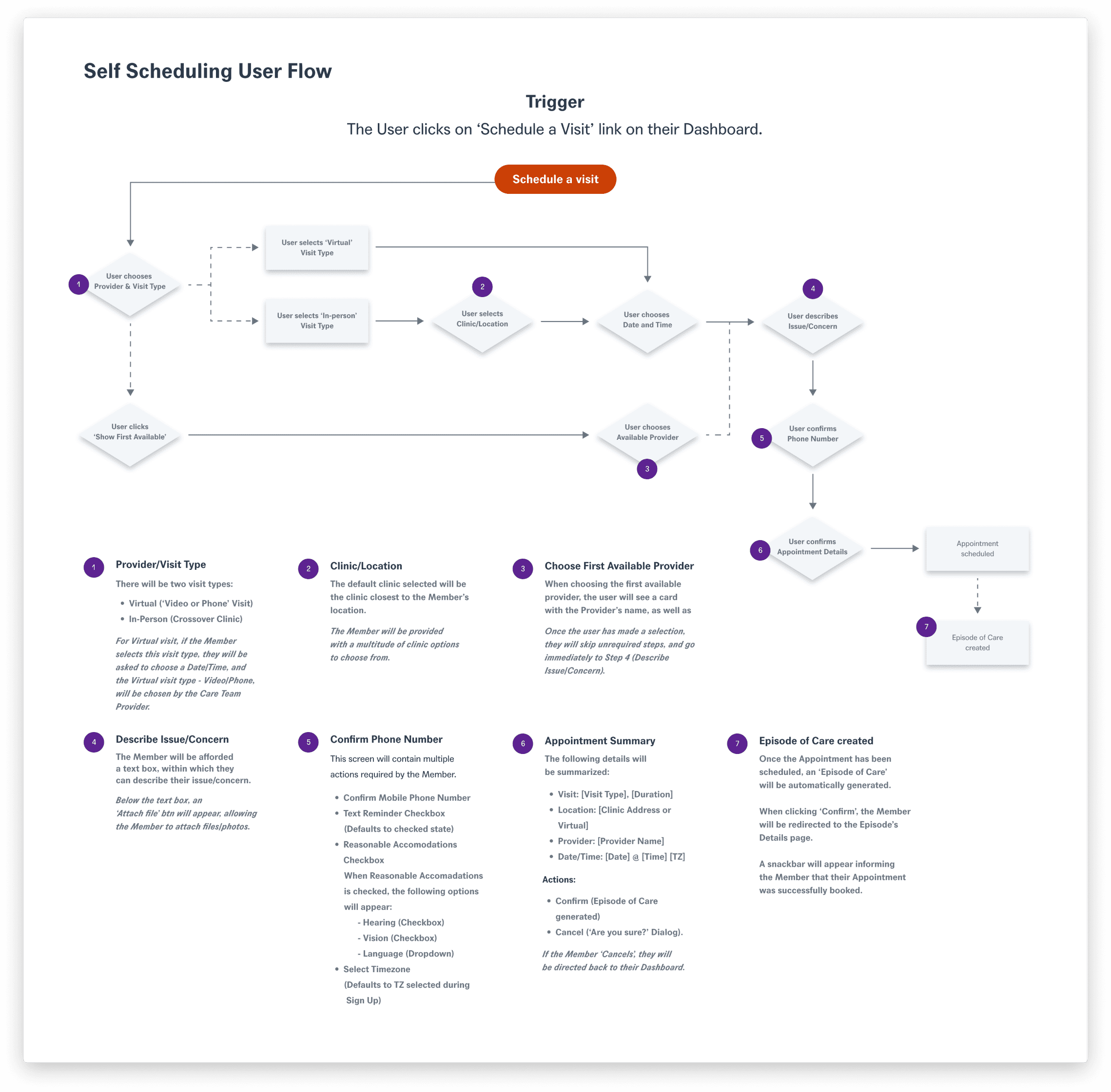
We outlined the following key requirements for the feature.
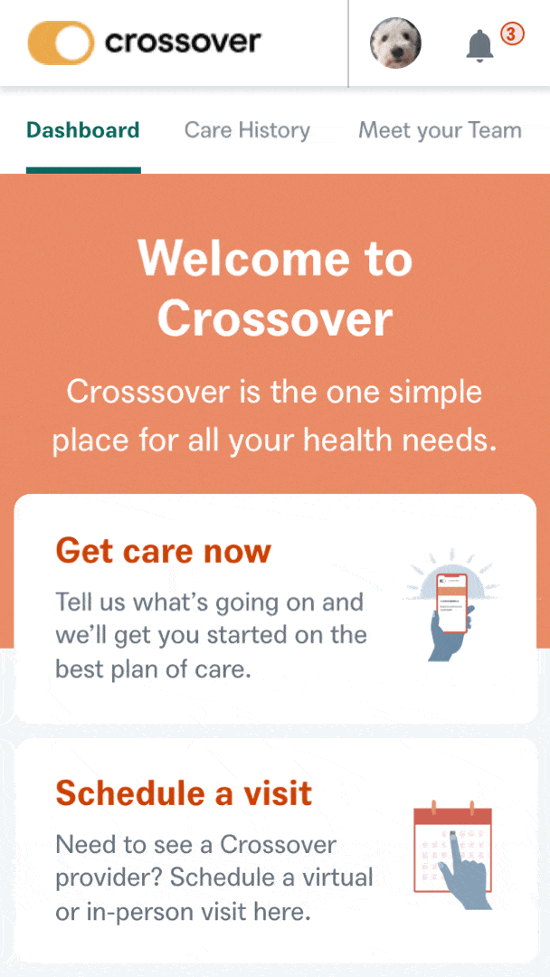
Call-to-Action
A prominent button on the user's homepage would encourage them to take action and schedule a visit.
Information Gathering
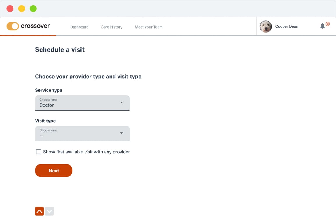
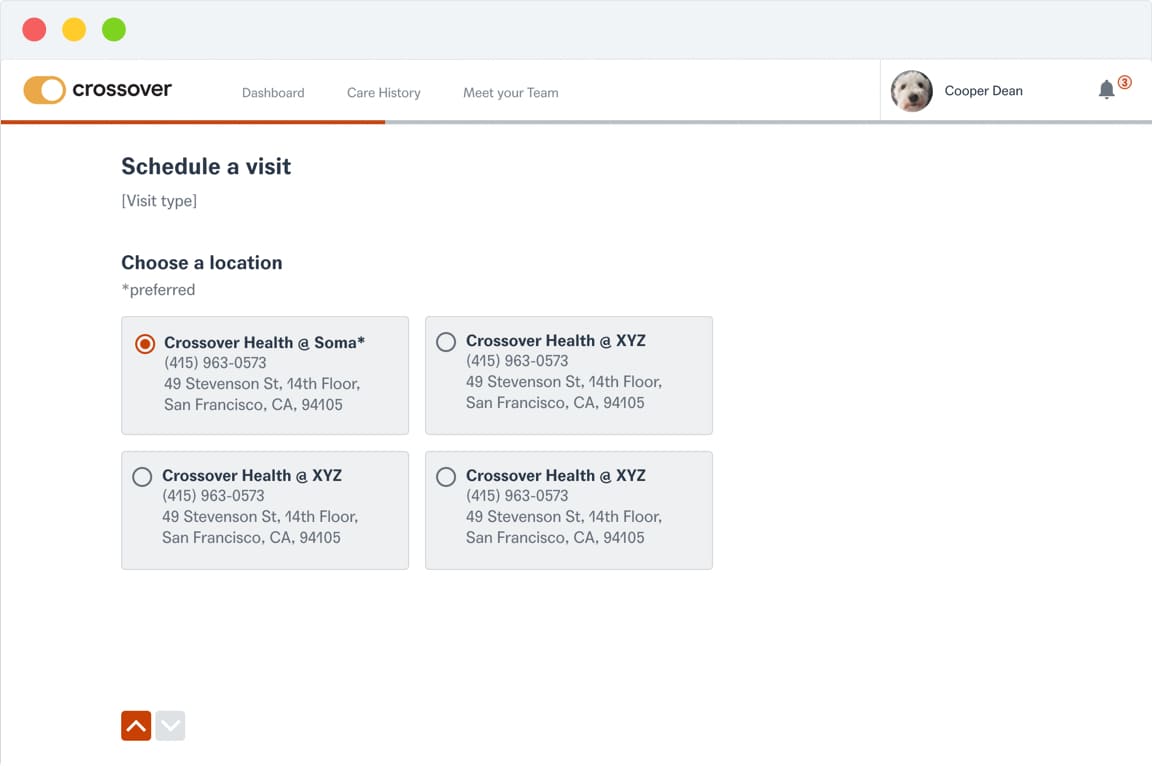
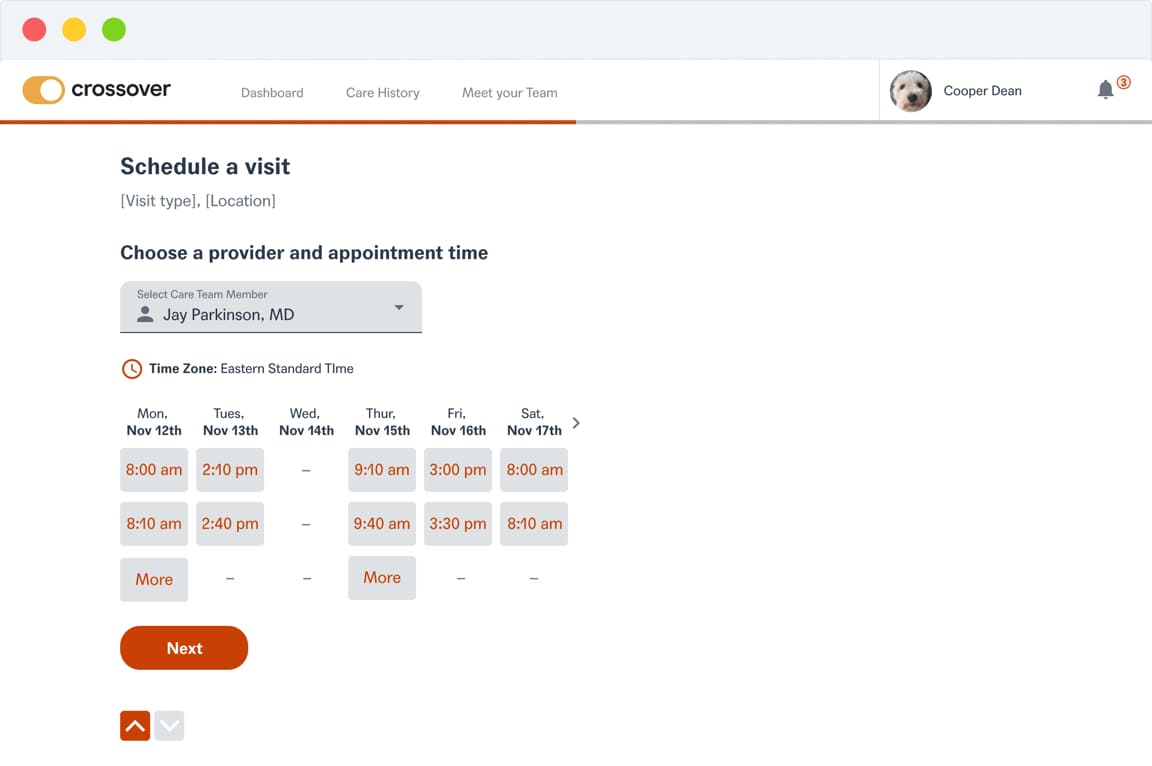
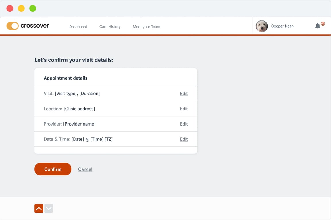
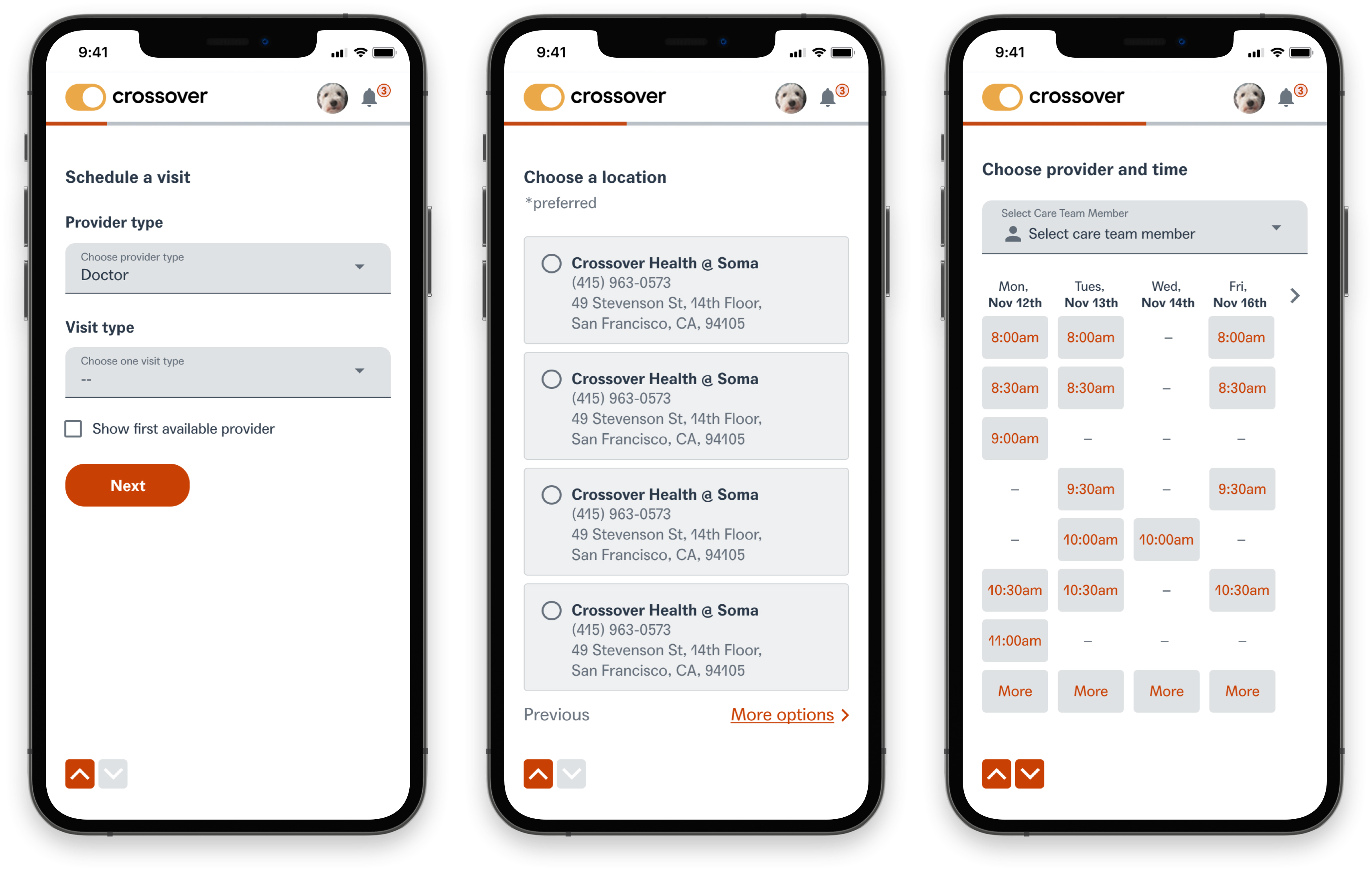
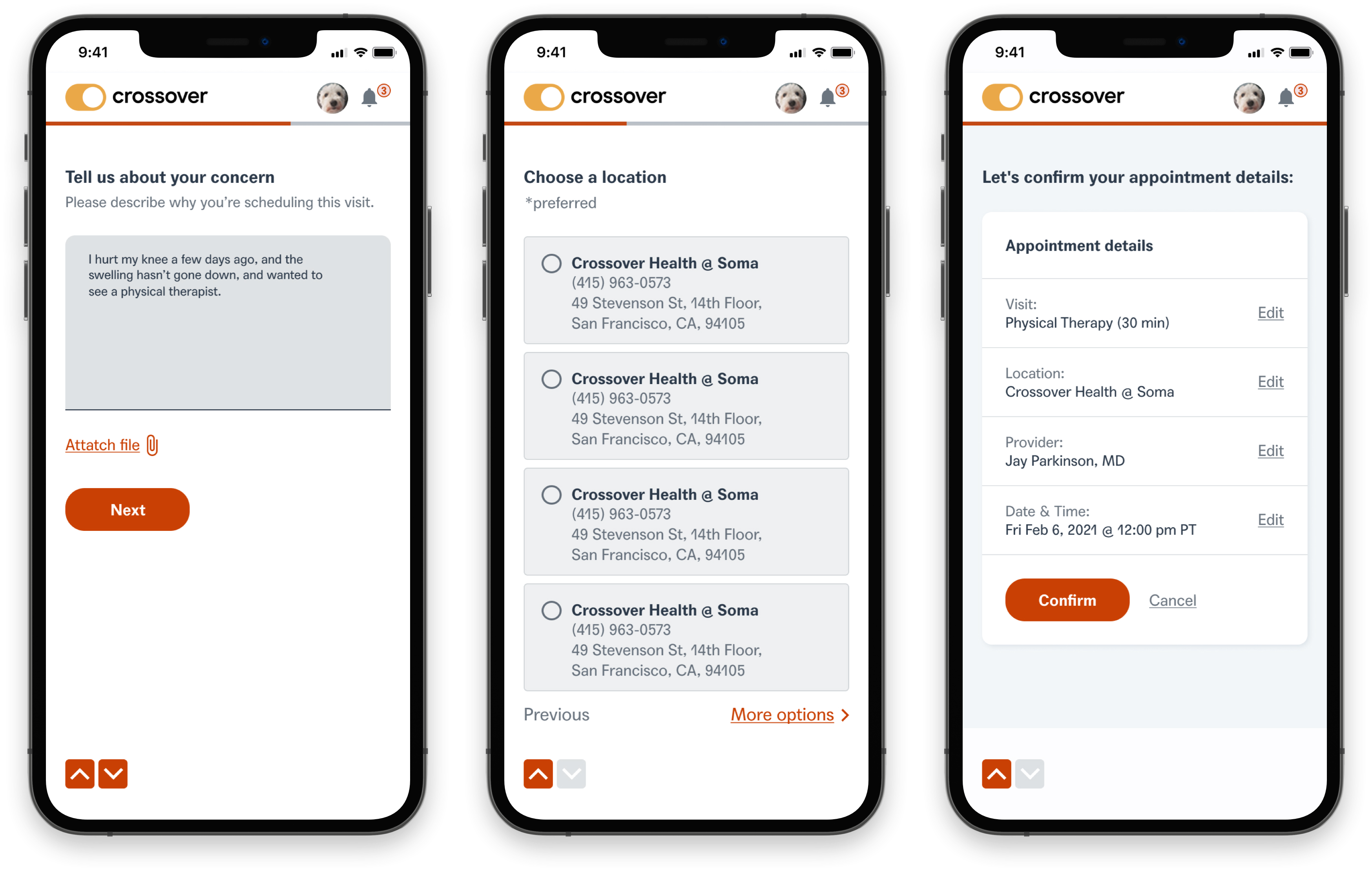
The user would need to select a provider, visit type, clinic, date, and time.
Episode Generation
Upon scheduling, an Episode of Care would be automatically created to track and document user care through the platform.
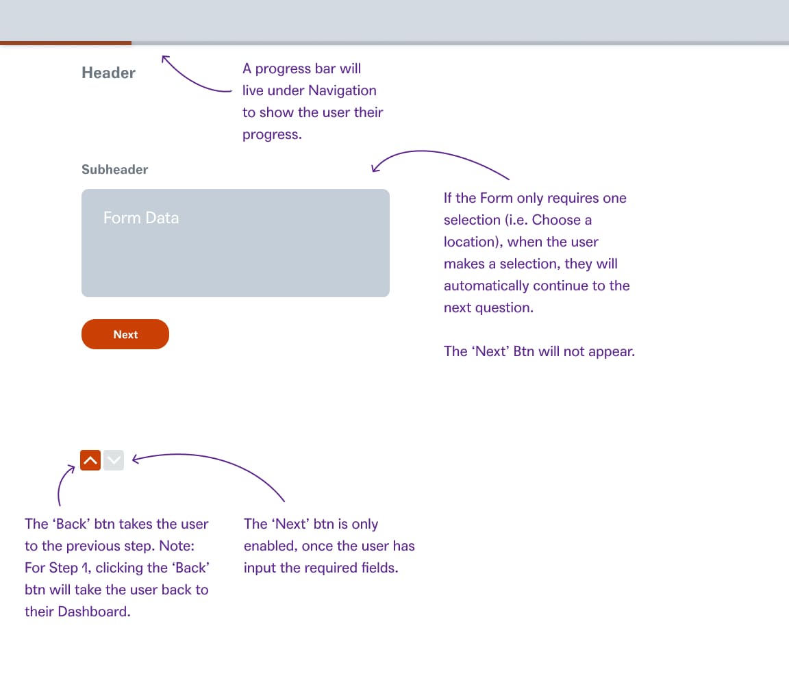
Final user flow
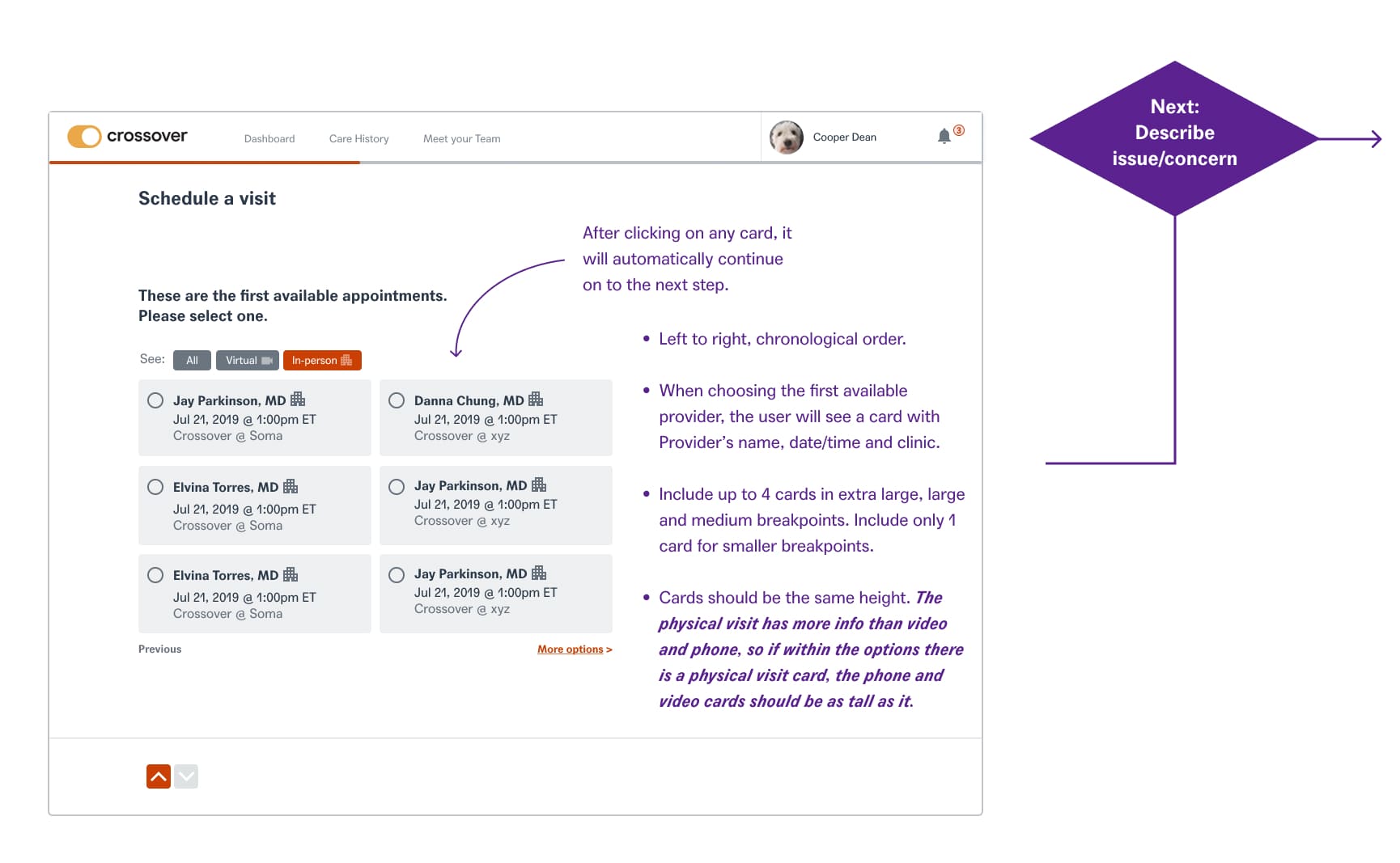
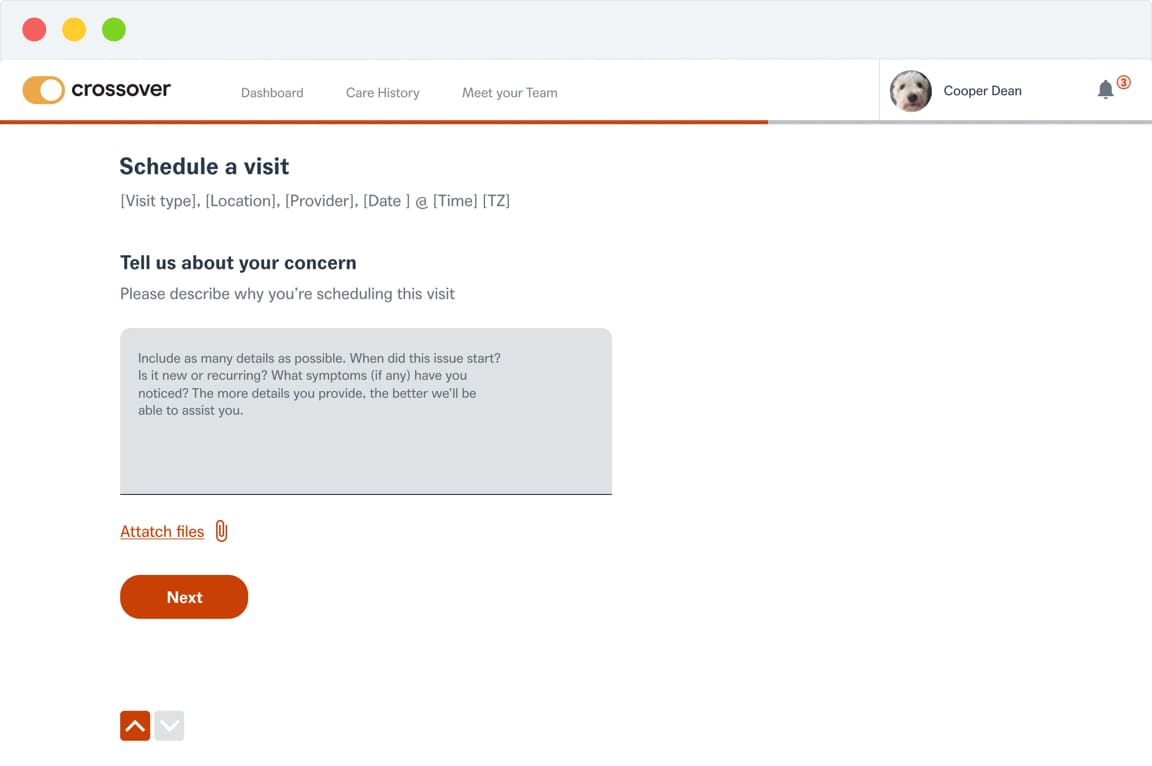
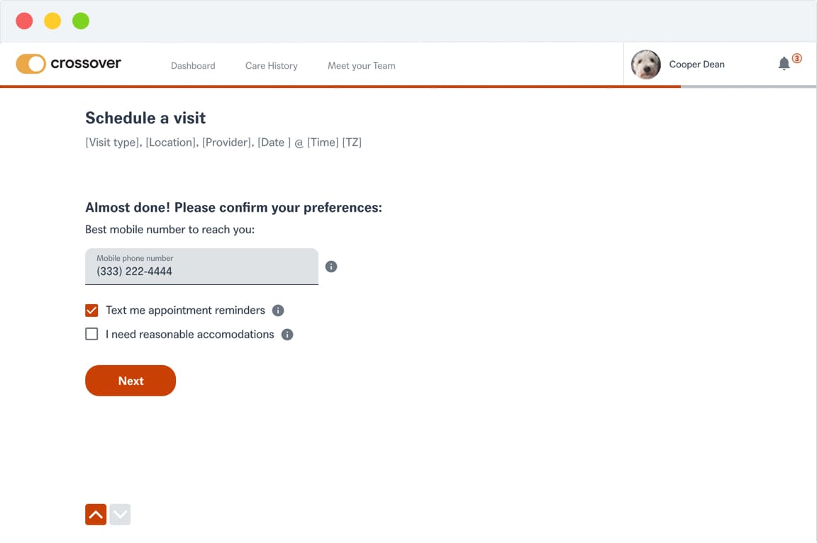
Final designs
Outcome
The new self-scheduling feature saw strong adoption, with a 72% usage rate among users. Insights gathered from customer feedback showed significant interest in the feature, and call volumes to clinics (for appointment scheduling) noticeably decreased.